
The Challenge
Archimica, a Contract Development and Manufacturing Organization (CDMO) producing active pharmaceutical ingredients (APIs), GMP building blocks, and late-stage intermediates, needed a cohesive brand identity to establish a commanding presence in a highly specialized, highly regulated market. The primary challenge was translating complex technical capabilities and pharmaceutical precision into a clear, compelling visual language that would build immediate trust with both innovative and generic pharmaceutical clients.
The Strategy
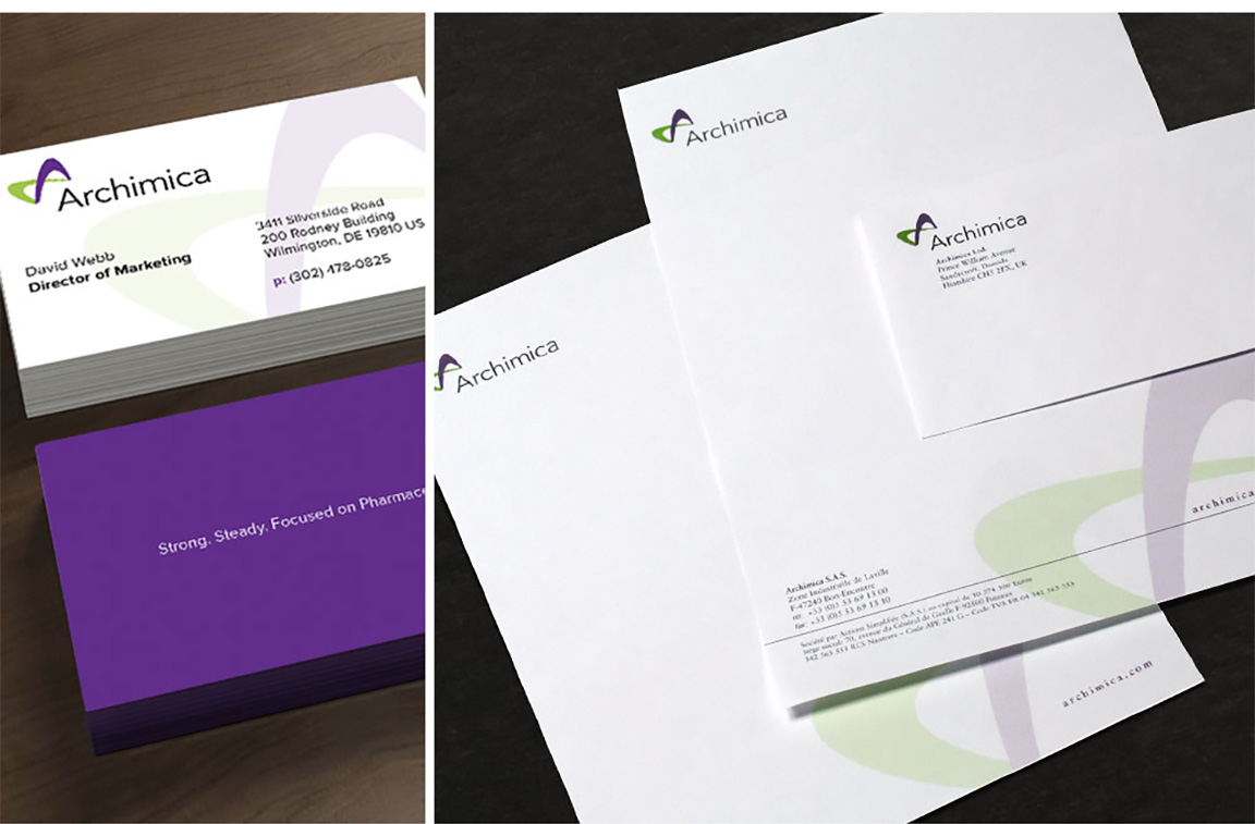
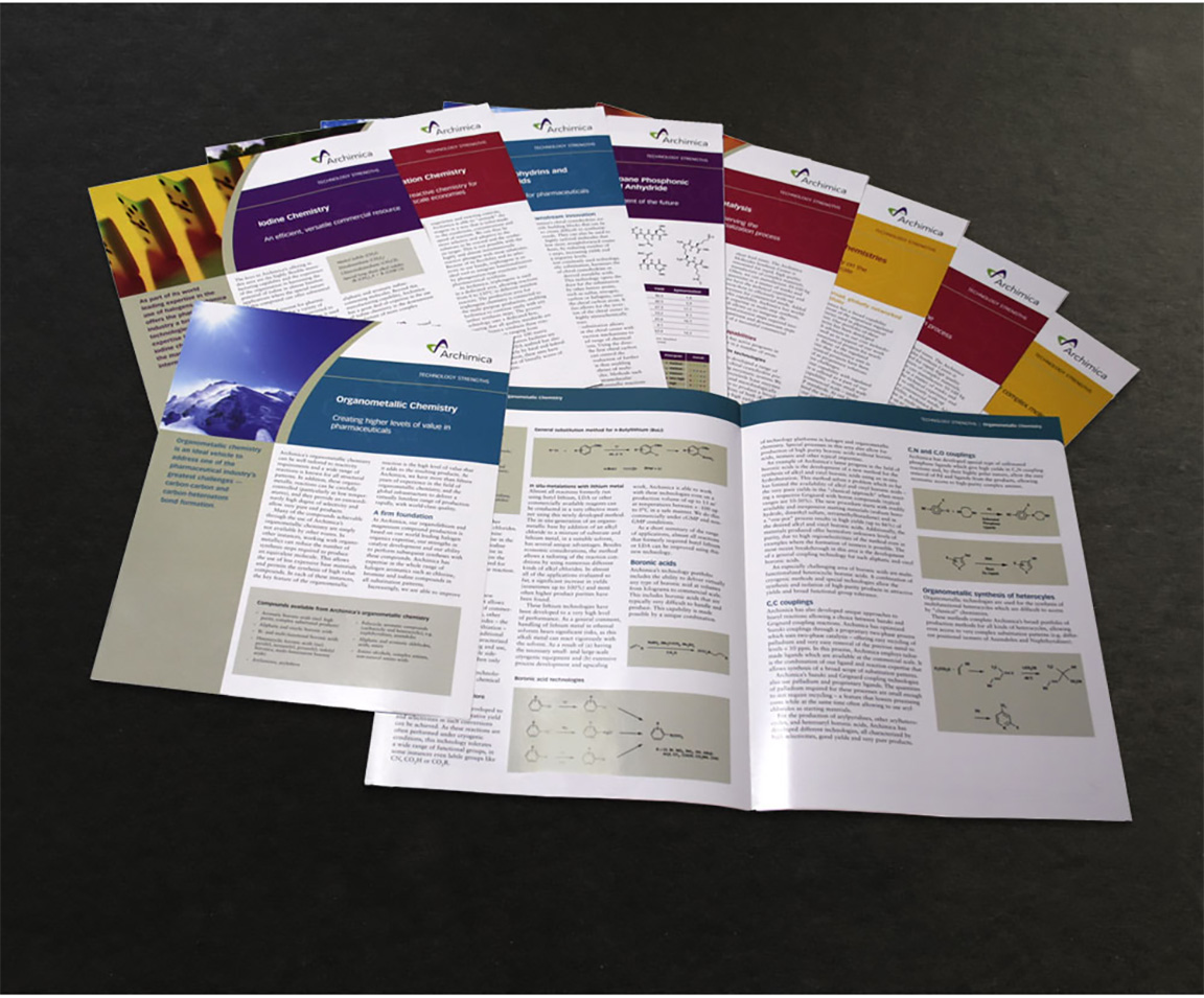
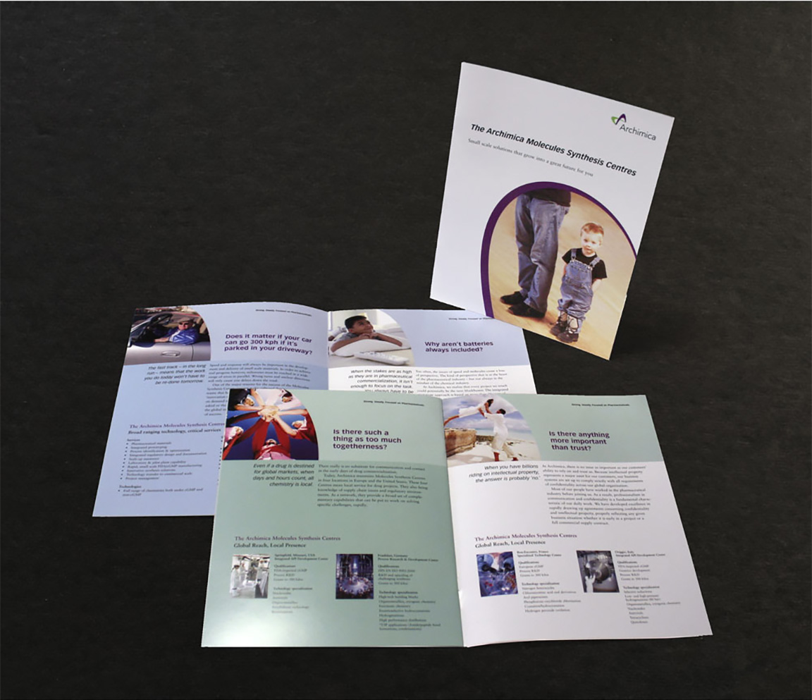
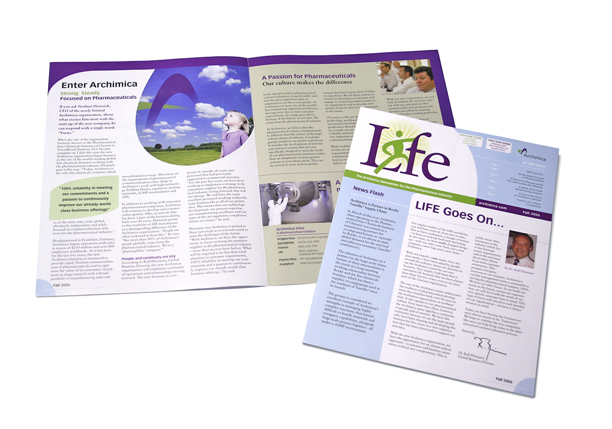
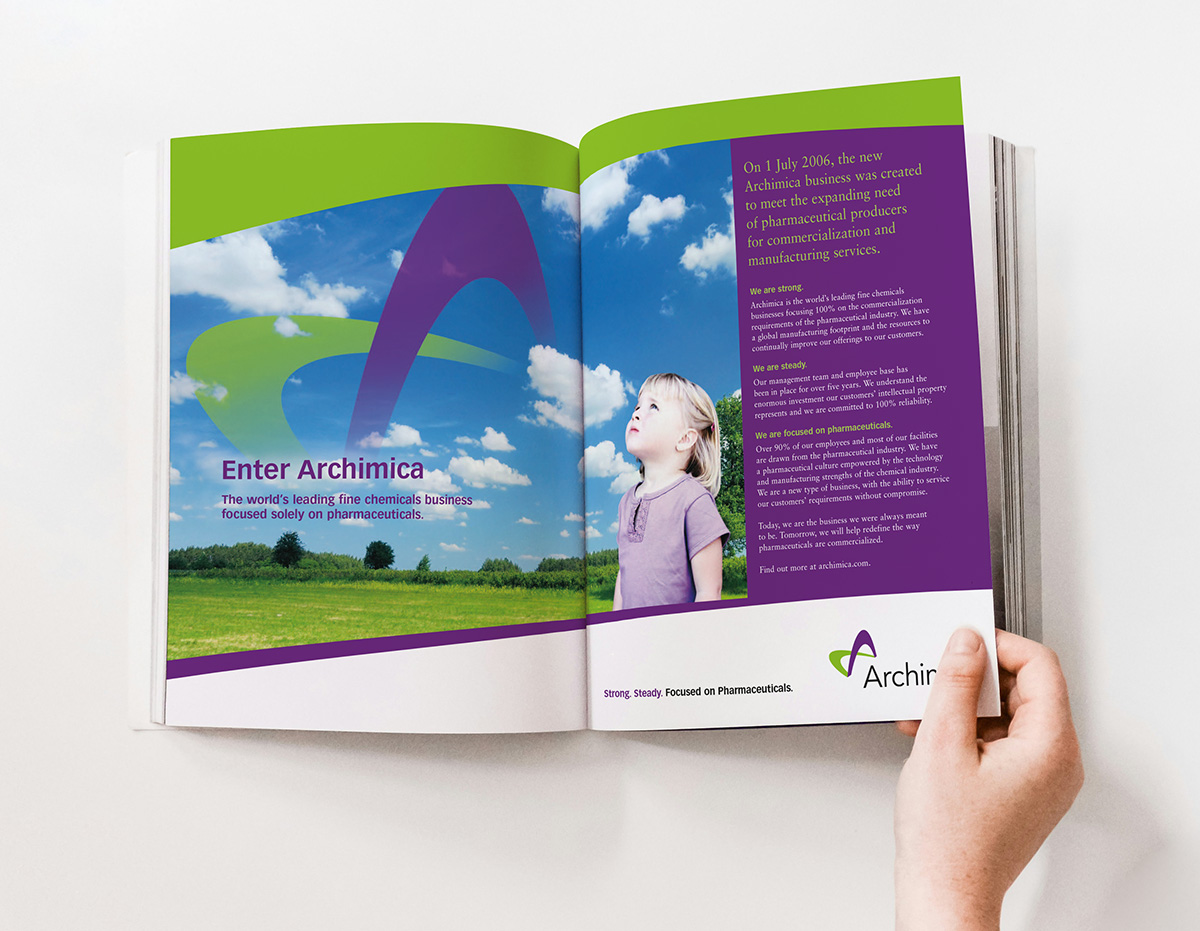
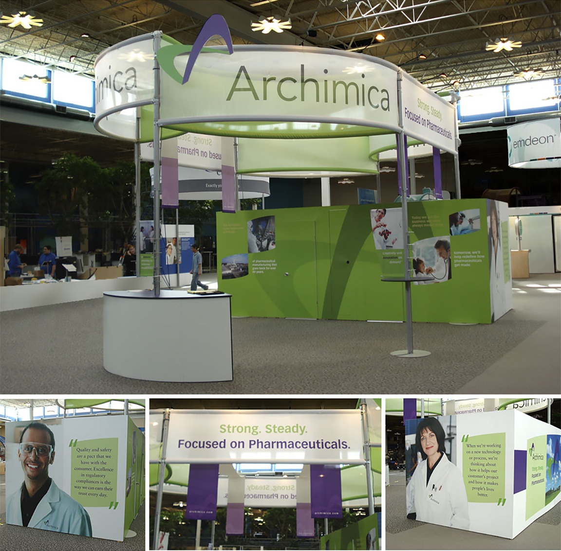
As the lead designer, I conducted in-depth client interviews to build a targeted creative brief and identified Archimica’s core differentiators, technical rigor, and market positioning. Guided by these insights, the logo concept combined the technical expertise with of a pharmaceutical company with the human touch of helping logo and developed comprehensive brand standards to ensure visual consistency across all touchpoints. To translate this identity into market impact, I executed an integrated collateral suite—including print and digital advertising campaigns, an overview brochure, product sell sheets, and newsletters—designed to communicate scientific excellence, reliability, and scale.
The Results
- Unified Visual Identity: Established a professional, recognizable brand presence across all corporate, marketing, and sales materials.
- Streamlined Sales Execution: Equipped the business development team with clear, high-impact sell sheets and brochures that effectively communicated technical capabilities to prospective client partners.
- Sustained Market Engagement: Drove audience reach and client retention through targeted ad campaigns and structured newsletter communications, cementing Archimica’s reputation as a dependable CDMO partner.